You may be interested to know that we are currently in the process of rolling out a new dashboard. For the last 6 years the QuickFile dashboard has remained largely unchanged and we felt that it was in need of some modernisation.
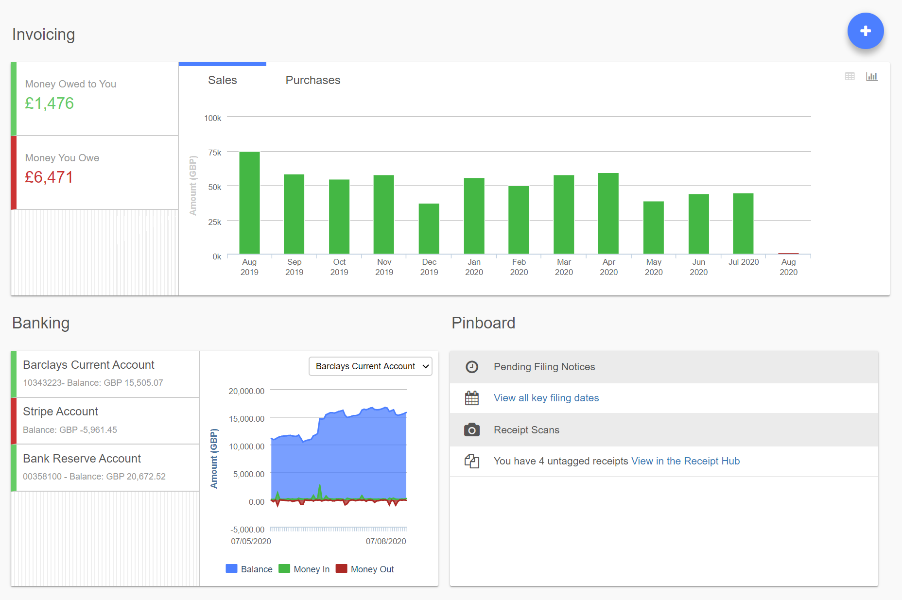
The new dashboard will allow you to visualise your rolling 12 month invoicing and purchasing position and make it easier to see financial trends. You can switch to a table view and drill down on your monthly invoice and payment totals, as you could on the original dashboard.
In the banking section we’ve retained the list of accounts and added a chart so you can quickly see your 3 month trend on credits/debits and balance movements.
We’ve also added a Pinboard tile which will be used to inform you of your filing deadlines, untagged receipts and tips on how you can get the most from QuickFile.
How do I enable the new dashboard?
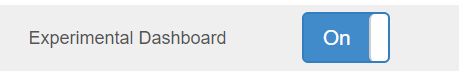
The dashboard will now be automatically enabled on new accounts. We’ll be gradually switching users over to the new dashboard in the next 2-3 weeks. If you’d like to switch now you can do so by going into Account Settings >> Advanced Settings then toggling on the “Experimental Dashboard”.
What about the original dashboard?
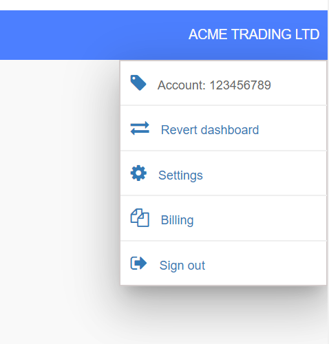
The original dashboard stays where it is for now so if you’d prefer to stick with that then it’s absolutely fine. If you’ve already been switched to the new dashboard you can revert back from the Advanced Settings area, or from the dashboard go into the top right hand menu and select “Revert dashboard”.
We hope you like the new dashboard design, as always if you have any feedback or suggestions just let us know.
Another related note, what happened to the nice clear and colourful green/red buttons in e.g. the advanced settings options? I realise green and red aren’t “cool” and the grey and blue are meant to look like an iPhone but this isn’t an app and I don’t own an iPhone, and this is a computer!
We are aware of an issue with the event log - it certainly shouldn’t be red but should be grey and left aligned (as it was before). We’re actively working on this at the moment.
What nominal is missing from the list? We’ll take a look at this now
I think I see what it’s doing here actually. I have a single nominal in the “additional dashboard ledger balances”, 1250 (the credit card). By default on the old dashboard it showed below the amount you owed the purchase ledger (which is what you got by clicking the figure above if you didn’t have a custom nominal) and it also lists the nominal accounts you have selected in addition.
The new dashboard just shows the additional nominals, but not the original purchase ledger. You can still access it by clicking the total above, but it isn’t as clear as the old dashboard in that I can see how much I owe suppliers and how much I owe the credit card at a glance. There’s also the confusion of the total for the purchase ledger does not equal the total owed, but if you click the total owed you do not see everything that makes up that total.
I’ve also noticed the hover tooltips on the columns of the bar chart aren’t clear. They show “Invoiced” & “ReceivedTotal”/“OutstandingTotal” for both purchases and sales. The old dashboard did have some distinction between the two, so I guess this is just a copy/paste error somewhere. There’s also a missing space between the words.
Overall it just seems to be taking up more space to show me more or less the same info. I was looking at the old one and thinking I’d be happy if you just got rid of the big block of buttons top left of the old dashboard and moved the recent log up, and made use of all the whitespace left and right. This is essentially what you’ve done but with the addition of expanding of the sales/purchases graphs. I think this is a waste of space (I never really look at those as it doesn’t really show me a true representation of what is going on) so this could be kept compacted, the pinboard moved up and the log placed where the pinboard is. As it stands the log looks awkward where it is, and is now off the bottom of the screen whereas I could see the most recent couple of events by default.
The new dashboard will also show the sales and purchase ledgers now on a distinct line.
Will look into this, it should however match the original dashboard, so if that’s not the case it will be fixed. We’ve also addressed the issue with the red text in the event log.
For some reason the monthly sales turnover figures are different in the two formats. I also noticed outstanding moneys in teh Aug 19 bar and checked it out, but couldn’t find any.
Where there’s no data for a given month the chart is currently not plotting anything on the x-axis. That should be fixed in the next release later today. I think that will resolve most of these issues.
I like this new dashboard. I wonder if you can adjust the x-axis for sales and purchases so it’s not locked at 0 but can accommodate negatives as well as positives. I have some sizeable negative purchases and sales which don’t show, so the display is a bit deceptive.
Thank you
@Daza1001 we’ve now implemented those warnings to the new dashboard.
@smithdrp please to hear that you like the new dashboard. Are you referring to credit notes, i.e. if you have say a month with more credit notes than invoices?