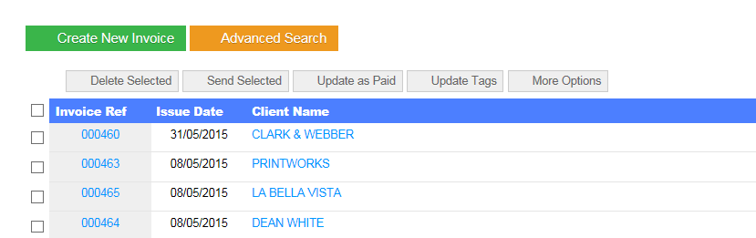
On some screen the markers for paid/unpaid/draft etc have been change, while these changes look good, they are not very practical, as they are very large, the colours are to bold for the plain and light coloured layout that these screens have. yes while they make their point about what they are about, the largeness and and heavy colour makes these screens very hard for looking at, the backgrounds of the rows are all the same colour and lines in between are very faint, every time i look at the screen, my eyes are instantly focusing on these new symbols.
If they must stay, is there anyway that you can make the separation between, clients and suppliers invoices etc more bolder, to negate the big bright coloured stamps.
Maybe alternate row shading? even the receipt number column background is very faint
With any sort of UI changes I’d rather wait to pool more feedback before looking at any changes. What we had before was very cluttered and needed some work. These things are very subjective although at least one other user did mention that the status labels are now much clearer than what they were before.
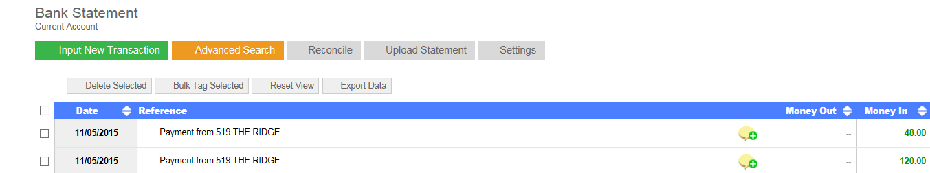
Thank you for your quick reply. As in your screen shot next to Invoice Ref, Issue date etc it is the up and down arrows that are missing so I can’t arrange in date order or invoice number order. It has only gone today. I am using internet explorer. I tried the refresh but it has not helped. I will try for a screen shot (not done before)
We use an Icon library called “Font Awesome” it sounds like this is not loading correctly for you. It could be that you need to update your browser or some other extension you have installed is blocking it.
I can’t replicated this on IE, Firefox or Chrome. I would recommend switching your browser, it should work fine then.
On the bank section those are images arrows, which we are slowly replacing by vectored fonts (as we’ve done on the sales and purchase lists).
The problem you have is that your browser is blocking the font-awesome library or it’s too old to support it. Finding out this cause is the solution to the problem.
If you press F12 on a screen where the icons are missing can you see any red error messages? I am afraid this is quite a technical subject but we need to determine why the fonts are getting blocked. The simpler solution is just to upgrade or change your browser.
Ok, how about making them a bit smaller then, they are rather large and add extra padding to the rows, and they massively dwarf the other two options on these rows
Personally I don’t believe the status labels look too big, this is how it looks on my screen, perhaps it’s different on yours? The overall row heights should be the same as the previous layout.
If you have a power user subscription you could override these buttons styles as follows:
.invoiceStatusContainer {
    font-size: 10px;
}
EDIT:
If you want me to apply this for you (assuming you have a power user sub) that won’t be a problem, just let me know?
Hi Glenn, I must say I have to agree with the OP as these new icons look gaudy. The previous ones were fine and I think QF had a smart look.
I have noticed most of the recent UI changes are tending towards the flat “Metro” look that is currently in vogue but it is a fad and like all fashions will change quickly. Good design should not pander to fads but in the case of QF and other business-like applications be about functionality rather than form.
Removing drop shadows and the 3D effect on icons and menus mean they are actually harder to read an distinguish from other screen areas. We are mostly binocular and as such see the world in 3 dimensions so it really should be utilised to aid navigation as it was previously.
It looks like change for the sake of it rather than to make QF work better.
We weren’t specifically trying to emulate the metro look but rather remove any unnecessary clutter. These pages were migrated from the old web forms aspx technology to MVC so 90% of the work here was mostly re-coding (not UI), we’re not just changing stuff for the sake of it, but it seemed like an opportune time to also tweak the UI. The code base change which we are doing now is to future-proof the application, as Microsoft will eventually cease development on web forms (aspx).
Really all we did on the main invoice, purchase and payment lists is remove the vertical lines, block the status labels and separate them out into a new columns. Before we had the statuses muddled in with all the icon options and it looked very cluttered.
With a Power User subscription you can restyle these back to how they were previously. I’m happy to provide the CSS to do this.
We have also had positive feedback on the UI changes, but I will take into account any criticism that these changes have reduced functionality/usability which is obviously not what we want.