I looked at the previous closed topic concerning this which was not helpful. People just moaned about the difficulty and others kept insisting it could either be done to some or hidden to others without actually explaining HOW they are deleted or hidden.
Hi @alantc
It’s possible to hide them from the dashboard (where you have an overview), but they will still be shown in the main list unless they’re deleted. However, only custom bank accounts can be deleted (e.g. not those that are created with your account, like Petty Cash).
From the bank management screen, view the bank account you wish to amend and go to More Options >> Settings. Unticking the “show on dashboard” will hide it from there.
If it’s possible, you will also find a deletion option here too, providing it’s a custom bank account and it’s empty.
Hope that helps!
Ah, thank you, so I am stuck with petty cash. So what if we use cash which is not so petty? Seems silly to have both cash and petty cash. I created an account called cash and hoped to delete petty cash. To be frank, I don’t like lots of pre set accounts which we are stuck with. I would like complete customisation which we can create ourselves as minimalistically as possible. Thank you for the clarification and hope eventually the application will allow the type of user control I desire. Part of running one’s own business or being self employed is that we are often the type of people who hate being told how to do things, we like to have control and get rid of anything which is periferal to what we want to concentrate on. Kind regards, Alan.
1 Like
From my dashboard I have two options, a compact version or hugely spaced out version where I even have to go to further effort of scrolling on my pretty large screen computer to see the credit card area. In compact view, I can see bank account, bank reserve account, directors loan account, cash account (with the amount in it), credit card but really these are just group headings, if I click on cash account a window opens just to show petty cash, with nothing in it, I have to do another action to get to my real cash account.
So we have a choice between compact view which doesn’t give us simple access to our real accounts or massively enlarged view which shows even accounts we are not using in large view making the need to scroll down to get to other accounts we actually use. Maybe this is modern design for modern age, give me the old sensible styling please of fashion from a few years ago. I think there is a confusion that big and bold is the modern styling but really it should only be big and bold, where for the original purpose of the intention of where needed to be for use on a small mobile screen, but now specific apps are designed for mobiles which are great so we don’t need massive layouts on pc screens please.
Most users use just the petty cash account rather than creating a specific cash account. If you would like help to move everything to the system code and remove the custom cash account, please let me know and I’ll be more than happy to help.
With the nominal codes, you can remove the ones you don’t use. Simply go to Reports >> Chart of Accounts >> More Options >> Add/remove popular codes.
Regarding your dashboard - I think there may be a bit of confusion here so I just want to clarify where you’re looking. We don’t typically offer a compact view, only the one view. Can you also clarify where you need to perform an action to get to the “cash account” as the two should be listed in the cash section itself.
Regarding the design, we do regularly carry out checks to ensure we’re catering for the most common screen sizes and systems. It is possible to change the design to an extent if you have a Power User Subscription, but at present, it is just the one design.
Thanks Matthew, I appreciate the excellent support level, but didn’t want to spoil your Sunday. I suppose I am a designer by trade and by nature and would just like to see what I really need to and click on what I want to use without scrolling and clicking where it could have been more effectively laid out. As for petty cash, I seem to have lost my cash in an account I cannot access anymore so if it can be put into the default petty cash that seems the way to go please. If I click on my cash account with a balance in, the petty cash comes up with no balance so suspect this a bug.
Matthew, I have deleted the cash account after first deleting both journals where it had money there from an opening balance coming from suspense account. So I think I have been successful thankyou.
Maybe I didn’t need to do this after all. Now my petty cash account says no transaction when I open it. But it does have a balance, but the problem here is that a balance doesn’t show unless there are also transactions. This gives the impression that there is nothing in the account whereas when in summary view of all bank accounts the balance does show up. So request please: Show the balance in accounts even when there are no transactions.
To clarify, the reason I thought I was unable to get into the cash account I had made myself, I now think is because it showed a big heading Petty Cash so that is what I thought I had open, but probably it was Cash within the Petty Cash group of accounts and as it showed ‘no transactions’ I hadn’t noticed the small label ‘Cash’ and thought I had open ‘Petty Cash’ even though I had clicked on my ‘Cash’ account. All this confusion because no balance was showing making the account look empty.
Hi @alantc
If there are no transactions even though there’s a balance, it sounds like you have an opening balance set on the account. If you’re unsure, you can view the settings of the bank account and this would show there:

Where are you seeing the big heading “Petty Cash”? There’s a group of bank accounts labelled as “Cash Accounts”, which sits between the equity and the loan accounts. If you have labelled your account as “Cash”, it should show as exactly that, similar to this:

If you’re seeing a balance in one place, but not another - could you let me know where the balance isn’t showing please and we can investigate this for you?
Hi Matthew, many thanks for this, but did you see earlier, I did manage to delete the account thankyou, and I updated the last message to explain some confusion.

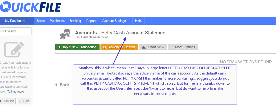
Matthew, while on the subject of improving the User Interface, it would be great if there could be an update soon to consolidate the accounts page. Please see attached.

By definition, a Dash-Board is a complete board where useful things are handy. What you have here is a part board as we need to scroll to get to the bottom. Fine on a mobile device but generally mobile apps are well designed focussing on what you need to see all at once. For desktop PC we want the complete picture unless there is good reason for otherwise. I used to like the old Quickbooks v 8. Then it changed and got worse afterwards. I don’t know why developers change good designs. Seems they get bored with round wheels and try octagonal ones.
If you have a power user subscription then there are snippets of custom JavaScript that will do a lot of what you’re after. To remove certain bank accounts from the main list:
jQuery(function($) {
    // remove dead bank accounts
    $('body.page-bank-index .tblbank .dataRow')
      .has('input.hdnbankNominalID[value="1200"]')
      .remove();
});
(replace 1200 with the nominal code for whichever account you want to hide).
Another thing that could be useful is this to pull your most frequently used accounts together into the topmost “general bank accounts” table:
jQuery(function($) {
    $('body.page-bank-index .tblbank .dataRow')
      .has('input.hdnbankNominalID[value="1230"], input.hdnbankNominalID[value="1250"]')
    .appendTo($('body.page-bank-index .tblbank tbody').first());
});
(again, change the 1230/1250 to whatever accounts you want to pull up, and you can add more input.hdnbankNominalID[value="NNNN"] alternatives as required).
You can also add custom CSS to shrink the space between the tables, for example:
body.page-bank-index .detailHeaderTable {
  margin-top: 10px; /* default = 60px */
  height: inherit;  /* default = 50px */
}
or even squash all the intermediate headers and make it so that it appears the whole list of bank accounts is in one table:
body.page-bank-index table.detailHeaderTable,
body.page-bank-index table.tblbank ~ table.tblbank thead {
  display: none;
}
(hide all section headings, and the blue column header section of all but the first sub-table)
Something else I have in my account is that I’ve added my most commonly used bank accounts to the “custom menu” links in the left hand column - navigate to the relevant bank account page, then + Add link and “add a link to this page”.
Thanks Ian, that sounds amazing but I’m really not that much of a geek. The current layout is more an annoyance than a major issue and I am trying to point out to Matthew at Quickfile how it could be better designed for everyone, not just power users.
Providing customisation in an accounting program via CSS is, I suspect, not what the vast majority of users want or can use.
If it’s any consolation @alantc, I fully agree with you. I trialled this accounting package because my current accounting program is not MTD capable but based on a number of issues I have decided to stay with my current accounting program and just use Quickfile for the bridging MTD.
I actually linked your post to mine in my last post to the developers of Quickfile to highlight the point that I (and you) were making. I am in full agreement. Your issue is not about tweaking the dashboard to suit your particular needs. Your complaint is the same as mine. There are a lot of irrelevant accounts added to the program by default, and unnecessary information showing on the dashboard and throughout the program and it doesn’t work well for any user in my opinion.
In my opinion, the desirable solution is to start with a clean slate and enable users to create their own bank accounts and their own COA instead of having to try to work out how to delete unwanted credit cards, petty cash accounts etc. My program works on the clean slate concept. I also find the dashboard filled with information I don’t want or need. Granted with my accounting program, I also had to tweak the dashboard in my program to get the optimal look, but the tweaks were more to suit my particular display preferences than to get rid of “bloat”.
I will be emailing the developers a link to my accounting program and hopefully they will see the points that I am making and perhaps change their program to follow the design concept of my accounting program which I have come to realise is actually very well designed although it looks deceptively basic. I am very happy with my accounting program in terms of how the program works, but development is slow and it lacks features that I would like. Having said that Quickfile lacks features that I currently already have that I won’t give up.
But perhaps in a couple of years, Quickfiles will be the better solution for me if development of my accounting program does not speed up. I won’t post again on Quickfiles forum talking about my accounting program as I don’t want to undermine Quickfiles as that would not be right. But I did want to say, I fully understand your complaints with deleting bank accounts and the current design of the program especially the dashboard. There is too much unwanted clutter in my opinion. But I like Quickfiles sufficiently that I will keep them in mind as an option to move to when they have introduced features that I want and if they address the navigation/clutter issue and if development of my own accounting program does not speed up a bit as I am still waiting after four years for some features requested.
Good luck as Quickfiles does seem to be a nice program and has a lot to offer
Delacor, I wholeheartedly agree with everything you have said here. I sincerely hope the improvements will be in the next update, hopefully a few weeks or months, rather than years. I think the increased revenue from attracting more customers to a much better design will compensate for the effort if Quickfile developers get on with the matter without delay. It may seem a big change but I really don’t think it is (the user interface issues, that is) and these improvements I would think would be possible in a short space of time.
Tomorrow we’ll be rolling out an update to allow unneeded bank accounts to be hidden in the bank section.
I don’t necessarily agree that some of these accounts should be hidden by default. In many respects they offer subtle hints to users on how certain things should be handled, i.e. that cash transactions should be managed in a type of virtual bank account. If the user has acknowledged this and then decides to remove the account, that’s absolutely fine.
Same goes for nominal ledgers. There are a handful of control accounts that shouldn’t be deleted, things like debtor/creditor control, vat control etc. You can already pair down the Chart of Accounts significantly and there’s plenty of scope for adding new codes as you go. Much of the detail in the CoA is used to generate accurate financial statements such as the P&L and Balance Sheet. There is a good argument however to just have the paired down CoA setup by default on new accounts.
We have a very broad spectrum of users from small owner managed businesses to experienced accountants. As you may appreciate it’s a challenge to get the balance right in terms of expectations on how things should be presented. We’ll certainly take the feedback onboard and look to adapt the UI where possible.
1 Like